10. The Ides of March
How do you get two of the handsomest men in the world in the same poster without recurring to silly face offs and awkward floating heads? You throw in a clever nod to duality via one of the most notorious magazines of our times. If only the movie had played with this duality in the same way, it would've been a real stunner.
9. One Day
This truly unbelievable picture does justice to Henri Cartier-Bresson and the iconic "The Kiss" by Alfred Eisenstaedt, in how both of them seem to really have captured something unique in time. The synergy between Annie and Jim Sturgess in this picture is sexy, romantic and aches with something that resembles nostalgia. Their feet seem to be in movement, as if this kiss can only happen in this instant, because their feet are moving them somewhere else immediately. Extra points for the exact measure of tongue to make this tasteful and not tacky.
8. Meek's Cutoff
The poster captures the single most breathtaking moment in the entire movie, which is a lot, coming from a movie where every scene demands to be paused and examined for their sheer beauty. Gotta love the fact that the illustrator alludes to both the era during which the movie takes place (the faded palette) and is also a wink to postmodernism.
7. Albert Nobbs
Simple. Straightforward. Concise.
Works as a more effective art piece than the actual movie.
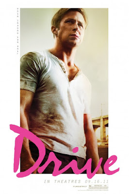
6. Drive
The font! The hot pink! The greasy look in Ryan Gosling's face! The vertical text!
Don't you just want to drop everything and go listen to synthpop the minute you see this poster?
5. Martha Marcy May Marlene
Like the cover of a 60s LP, the images are haunting and warm. We see the juxtaposition between the women (it's the same woman actually) and are reminded of summer haziness. The semi open mouth an invitation for a kiss, maybe? A song about to come out?
Then there's that male figure in the background. A lover? A threat? No other poster summed up its movie's mood and psychological dilemma better than this.
4. Shame
The covers are both repulsive and inviting.
The simple title feels more like an ironic proposal than an accusatory statement.
Are you in?
Like Millais' Ophelia, Lars von Trier's Justine looks at us from what looks like it will be her watery grave.
Kirsten Dunst's eyes seem fixed on her beholder but then we notice there is something reflecting on the upper right. It's the title planet set to crash against our own. Justine's intention then seems to change, she is no longer looking at us announcing her fate, she's lovingly looking towards the skies, accepting her new beginning. She's marrying the night, indeed.
2. Jane Eyre
Haunting and creepy like a 19th century cameo, this poster best captured the phantasmagoric qualities of its source material and the elegance with which the film version updated it.
1. The Girl With the Dragon Tattoo
The teaser is movie star power at its best and rawest. Daniel Craig and Rooney Mara look at us directly, his arm over her as if trying to conquer Lisbeth Salander's intensity. Without even smirking her hand is on top of his arm, it is she who's in control. The final one-sheet took this concept to the next level, like Jane Eyre's, this poster also has something that resembles romantic melancholy. The story after all isn't merely about a tarnished journalist and the bisexual goth hacker, it's a deep love story about people coming together when they least expect it to. The darkness that surrounds them is nothing but a misstep. Like the haunting tagline reminds us, secrets only are revealed when their time arrives.
How about you? What were your favorite posters this year?


No comments:
Post a Comment