Where we take a look at posters for upcoming features.
Up until a few minutes ago I had no idea what Moonrise Kingdom was about, now that I know, this poster is a thing of beauty. However before finding out what the plot was, the poster gave me a slightly creepy vibe, it reminded me of a Todd Solondz movie and we all know those aren't exactly fuzzy and cute.
What does the Moonrise Kingdom one-sheet say to you?
Showing posts with label Sheet-y Saturday. Show all posts
Saturday, March 10, 2012
Saturday, March 3, 2012
Sheet-y Saturday.
This exclusive poster for John Carter was designed by J.C. Richard for a special Mondo screening of the upcoming film and it's utterly perfect. The soft colors recall the excitement of finding a washed out sci-fi paperback among your dad's belongings and the detailing demands you look at it forever. The canyons, the color of the skies, the planets above, the thrill of that beam coming out of a spaceship...and then the single human being standing in awe of all of this. This one sheet makes us become John Carter and as such it's truly a work of art.
Excited about this movie?
Labels:
Andrew Stanton,
Posters,
Sheet-y Saturday,
Taylor Kitsch
Saturday, February 11, 2012
Sheet-y Saturday.
Where we take a look at posters for upcoming features.
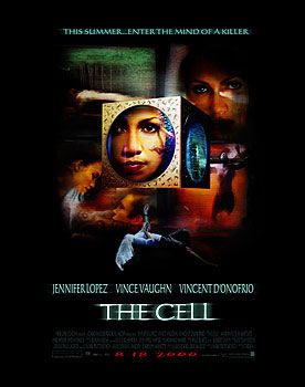
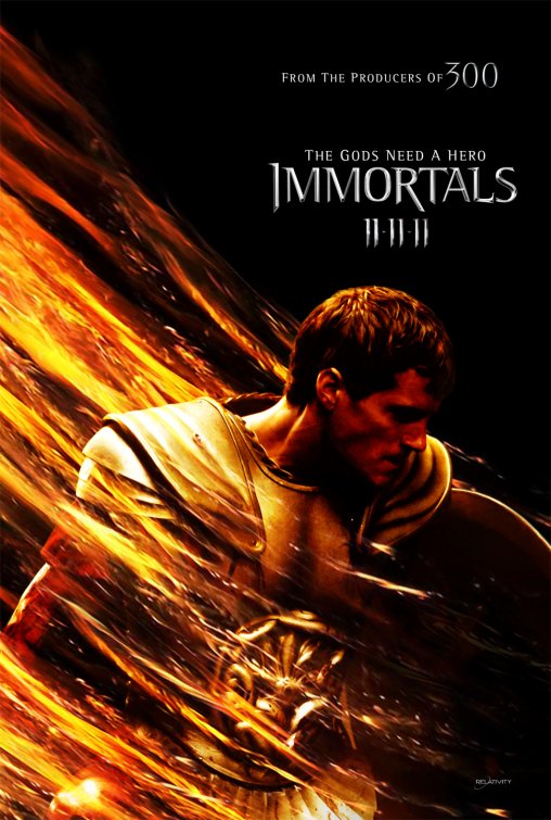
Whoever is behind this one sheet for Mirror Mirror had only purpose in mind: destroy Tarsem movies from having flawless poster designs. Check out the posters released for The Cell, The Fall and Immortals all of which were visually intriguing movies, with imaginative graphic campaigns. What we have here is Photoshop gone seriously wrong and also slightly plagiarist.
For starters, do not showcase your movie's castle when Princess Jasmine isn't anywhere to be found, wait, are you telling me this isn't the castle from Aladdin?
Next, do not have Armie Hammer look like he's still wearing J. Edgar old age makeup...he's supposed to be the prince, not Snow White's creepy stalker. Next, do not make the elves look like a comedy troupe out of a Chelsea Handler fantasy. Last but not least, don't make people believe your heroine has no arms. Unless this is also an adaptation of Wicked, Snow White was never known for her lack of limbs. Seriously, the teasers featuring individual characters were much, much nicer.
After the overloaded disaster we just saw, this poster is absolutely breathtaking. I don't even know what the movie's about, but the way in which they captured the imminent disappearance of love (don't you want to just try and contain those falling streams from dissolving the couple?) makes me already ache for how heartbreaking this movie will be.
What's your take on these puppies?
Labels:
Armie Hammer,
Julia Roberts,
Lily Collins,
Posters,
Sheet-y Saturday
Saturday, February 4, 2012
Sheet-y Saturday.
Where we take a look at posters for upcoming features.
See this poster for example, the ridiculous pink skies and the ship in movement, suggest something straight out of a bad Asian hologram postcard or a cheesy karaoke video, but there is something about the tacky embossed logo, or the doe-eyed looks in Leo and Kate's faces that just goes "click". It's sigh inducing and nostalgic all at once.
How do you feel about this re-release?
Saturday, January 28, 2012
Sheet-y Saturday
Where we take a look at posters for upcoming features.
Saturday, January 14, 2012
Sheet-y Saturday.
Where we take a look at posters for upcoming features.
These posters for The Iron Lady are truly fantastic, if only all campaigns were this inventive...the only thing I find weird is that they all seem to attack Maggie, as if the movie is predetermining audiences stances of her controversial legacy. I mean, someone out there might like her, no?
I couldn't care less about the re-release of Episode I, however I find it curious that they're bringing the usually classic Star Wars posters to the 21st century and using the "big head and big text" technique. Makes for a nice visual, huh?
What's your take on these two? Excited about Star Wars coming back to theaters?
Saturday, December 31, 2011
Sheet-y Saturday: Best Posters of 2011
Where we take a look at the year's best posters.
10. The Ides of March
How do you get two of the handsomest men in the world in the same poster without recurring to silly face offs and awkward floating heads? You throw in a clever nod to duality via one of the most notorious magazines of our times. If only the movie had played with this duality in the same way, it would've been a real stunner.
8. Meek's Cutoff
The poster captures the single most breathtaking moment in the entire movie, which is a lot, coming from a movie where every scene demands to be paused and examined for their sheer beauty. Gotta love the fact that the illustrator alludes to both the era during which the movie takes place (the faded palette) and is also a wink to postmodernism.
3. Melancholia
Like Millais' Ophelia, Lars von Trier's Justine looks at us from what looks like it will be her watery grave.
Kirsten Dunst's eyes seem fixed on her beholder but then we notice there is something reflecting on the upper right. It's the title planet set to crash against our own. Justine's intention then seems to change, she is no longer looking at us announcing her fate, she's lovingly looking towards the skies, accepting her new beginning. She's marrying the night, indeed.
2. Jane Eyre
Haunting and creepy like a 19th century cameo, this poster best captured the phantasmagoric qualities of its source material and the elegance with which the film version updated it.
1. The Girl With the Dragon Tattoo
The teaser is movie star power at its best and rawest. Daniel Craig and Rooney Mara look at us directly, his arm over her as if trying to conquer Lisbeth Salander's intensity. Without even smirking her hand is on top of his arm, it is she who's in control. The final one-sheet took this concept to the next level, like Jane Eyre's, this poster also has something that resembles romantic melancholy. The story after all isn't merely about a tarnished journalist and the bisexual goth hacker, it's a deep love story about people coming together when they least expect it to. The darkness that surrounds them is nothing but a misstep. Like the haunting tagline reminds us, secrets only are revealed when their time arrives.
How about you? What were your favorite posters this year?
10. The Ides of March
How do you get two of the handsomest men in the world in the same poster without recurring to silly face offs and awkward floating heads? You throw in a clever nod to duality via one of the most notorious magazines of our times. If only the movie had played with this duality in the same way, it would've been a real stunner.
9. One Day
This truly unbelievable picture does justice to Henri Cartier-Bresson and the iconic "The Kiss" by Alfred Eisenstaedt, in how both of them seem to really have captured something unique in time. The synergy between Annie and Jim Sturgess in this picture is sexy, romantic and aches with something that resembles nostalgia. Their feet seem to be in movement, as if this kiss can only happen in this instant, because their feet are moving them somewhere else immediately. Extra points for the exact measure of tongue to make this tasteful and not tacky.
8. Meek's Cutoff
The poster captures the single most breathtaking moment in the entire movie, which is a lot, coming from a movie where every scene demands to be paused and examined for their sheer beauty. Gotta love the fact that the illustrator alludes to both the era during which the movie takes place (the faded palette) and is also a wink to postmodernism.
7. Albert Nobbs
Simple. Straightforward. Concise.
Works as a more effective art piece than the actual movie.
6. Drive
The font! The hot pink! The greasy look in Ryan Gosling's face! The vertical text!
Don't you just want to drop everything and go listen to synthpop the minute you see this poster?
5. Martha Marcy May Marlene
Like the cover of a 60s LP, the images are haunting and warm. We see the juxtaposition between the women (it's the same woman actually) and are reminded of summer haziness. The semi open mouth an invitation for a kiss, maybe? A song about to come out?
Then there's that male figure in the background. A lover? A threat? No other poster summed up its movie's mood and psychological dilemma better than this.
4. Shame
The covers are both repulsive and inviting.
The simple title feels more like an ironic proposal than an accusatory statement.
Are you in?
Like Millais' Ophelia, Lars von Trier's Justine looks at us from what looks like it will be her watery grave.
Kirsten Dunst's eyes seem fixed on her beholder but then we notice there is something reflecting on the upper right. It's the title planet set to crash against our own. Justine's intention then seems to change, she is no longer looking at us announcing her fate, she's lovingly looking towards the skies, accepting her new beginning. She's marrying the night, indeed.
2. Jane Eyre
Haunting and creepy like a 19th century cameo, this poster best captured the phantasmagoric qualities of its source material and the elegance with which the film version updated it.
1. The Girl With the Dragon Tattoo
The teaser is movie star power at its best and rawest. Daniel Craig and Rooney Mara look at us directly, his arm over her as if trying to conquer Lisbeth Salander's intensity. Without even smirking her hand is on top of his arm, it is she who's in control. The final one-sheet took this concept to the next level, like Jane Eyre's, this poster also has something that resembles romantic melancholy. The story after all isn't merely about a tarnished journalist and the bisexual goth hacker, it's a deep love story about people coming together when they least expect it to. The darkness that surrounds them is nothing but a misstep. Like the haunting tagline reminds us, secrets only are revealed when their time arrives.
How about you? What were your favorite posters this year?
Labels:
Best of 11,
Charlotte Gainsbourg,
Daniel Craig,
Dragon Tattoo,
Elizabeth Olsen,
George Clooney,
Glenn Close,
Kirsten Dunst,
Lars von Trier,
Michael Fassbender,
Rooney Mara,
Ryan Gosling,
Sheet-y Saturday
Saturday, December 17, 2011
Sheet-y Saturday.
Where we take a look at posters for upcoming features.
While not a big fan of the Alien series myself (feel free to burn me at the stake...) I find myself all sorts of excited about the upcoming Prometheus. The first teaser, of course, says absolutely nothing more than "I am a dark moody sci-fi flick that might haunt your nightmares for years to come", but they got themselves one killer tagline!
Are all teasers for 2012 going to be shadows against blueish spotlights? (See above!) Unlike Prometheus though, Rock of Ages is all about flaunting that cast. Is it me or are all of you excited to see CZJ in another musical? A Tony and an Oscar prove these might be the only thing she should be working in...
Saturday, December 10, 2011
Sheet-y Saturday.
Where we take a look at posters for upcoming features.
You mean Madge means serious business when her name isn't mentioned in huge, glittery letters anywhere in the poster for W.E. Gotta love the tasteful Tiffany blue and the beautiful still of Andrea and James (who knew the king was so buff?). However the tagline sounds so forced and almost catastrophic, gotta give kudos of sorts to the designer who decided that people would be too stupid to get the title and highlighted the W and E in the characters' names. Really people, most of the ad campaign for this movie has worried about the title and what it means. Wouldn't it have been easier to change it?
The look on Fassy's face! The hand going to his Fassboner! The other hand showing the emptiness next to him! This poster fulfills on the promise made by every other wonderful piece of advertising done for this movie. It's truly breathtaking!
Saturday, December 3, 2011
Sheet-y Saturday.
Where we take a look at posters for upcoming features.
Angelina Jolie has never really been a particularly exciting or versatile actress yet somehow I'm very curious about what she might bring to the table as a director. The fact that this poster doesn't make her name the biggest thing about it makes me think she's trying to show the world she's more than a pair of luscious lips and Mrs. Pitt.
Excited about either of these?
Labels:
Andrew Stanton,
Angelina Jolie,
Posters,
Sheet-y Saturday,
Taylor Kitsch
Saturday, November 19, 2011
Sheet-y Saturday.
Japanese people have a strange sense of humor and very different aesthetics from us Westerners but I really can't guess what they were trying to go for with this poster for Young Adult. Between the Hello Kitty shirt and the disheveled hair there's really no big contrast. Were they trying to show that Char is up to no good but has potential? Because so far look like lazy Sunday outfits.
The looks on CaMu and Fassy in this poster say it all. They didn't even need to bother saying the name of the movie. What a superb work this is. I am dying to see this one...
Saturday, November 12, 2011
Sheet-y Saturday.
Where we take a look at posters for upcoming features.
Today we will see how one campaign can offer both the best and worst in graphic design. The image above is of course an example of the worst. Silly color palette, preposterous Photoshop-ing (where the hell is ScarJo coming from and why does she look like Kim Cattrall?) and one of those "universal" poses where all the characters look ahead into the distance. In this case they might just be trying to look away from the awful background they were inserted into.
Now on the other side, we have the same marketing people come up with this beautiful, simple and ridiculously effective teaser. The colors are astonishingly beautiful and efficient, the idea of mixing the tree with the animal prints is superb and the little red kite adds a dash of melancholy. We know more about the movie with this poster, than with the hideous design before it.
Which of these posters give you more information about the movie?
Saturday, November 5, 2011
Sheet-y Saturday.
Where we take a look at posters for upcoming features.
Oh the French, while silly Americans worry about the notion of sex onscreen and Michael Fassbender's cock, the French not only dare to put a male figure on the suggestive poster, but the moving hand implies it's heading to somewhere a bit more risqué. Despite the weird proportions of the body (the too smooth sides make it look like a woman in serious need of Nair) applause to the European distributor for reminding us that we all want to see this movie for the same kinky reasons.
More and more, this movie reminds me of a reverse Mrs. Doubtfire. Also, the drastic change from the original, perfect teaser, to this more common one-sheet makes it seem like the studio is worried it'll only attract nerdy arthousers (which it will...). With that said, Aaron Johnson should be in much more movies. Still wonder what they see in Wasikowska though...
What's your own take on all the
Saturday, October 29, 2011
Sheet-y Saturday.
Labels:
Daniel Craig,
David Fincher,
Rooney Mara,
Sheet-y Saturday
Saturday, October 22, 2011
Sheet-y Saturday.
Where we take a look at posters for upcoming features.
Why would anyone try to make a Lars von Trier film feel like a cross of The Craft and a Bewitched prequel (Kiki looks like a young girl becoming aware of her powers...ooh I see some X-Men in it too!) especially after the original - and somewhat controversial - first poster created one of the most iconic images of the cinematic year.
After the awesome trailer reminded us that less is more, the graphic campaign for The Woman in Black is a joyful example of how imaginative marketers can create a mood without recurring to cheap, stereotypical techniques. Gotta love how the sepia creepiness of the eyeless children (I maintain to this day that there are few things as scary as ghost children) is almost enough to take our attention away from the ghastly presence that seems to be overtaking them! The play this film is based upon is a wonderful combination of horror and comedy, so far it seems the filmmakers are tapping onto this.
So, what's scarier? The lazy Kiki work or the eyeless children?
Saturday, October 15, 2011
Sheet-y Saturday.
Where we take a look at posters for upcoming features.
This teaser might be the best poster I've seen all year long. Simple but interesting, with a superb use of color (blue takes the eroticism out of the unmade bed) and a spectacularly subdued font, it encompasses everything that makes Shame such a fascinating project. You want to dive into this bed, in the same way you're repulsed by its filthiness. I am dying to see how the larger American audiences, who are historically conservative, receive this movie about sex addiction!
Ready to get in bed with Fassy and CaMu?
Saturday, October 1, 2011
Sheet-y Saturday.
Where we take a look at posters for upcoming features.
The title placement, the subtle font and the whole layout makes this seem more interesting than it has any right to be. If you got two Oscar winners and still focus on the new face, you must have something interesting cooking up, no?
Labels:
Sandra Bullock,
Sheet-y Saturday,
Stephen Daldry,
Tom Hanks
Saturday, September 24, 2011
Sheet-y Saturday.
Where we take a look at posters for upcoming features.
See, I can appreciate the fact that The Iron Lady is trying to do something different. The teaser was perfect (even if you're not into Meryl's mimicry) but as much as I can admire their gutsy advertising campaign, I don't get what they were trying to do with this poster.
We can see that Margaret Thatcher became equal to Parliament and England but what exactly is the shape we're seeing? It seems to me like the designers just thought that sticking two contrasting images together would make sense...but something's missing. No?
Johnny Depp bores me. This poster does not. Gotta love how even in its The Hangover redux feel (the tagline...) this one sheet still has a very playful tone to it. The fish! The bowling pins! Depp's cute boxers! The red plane with that sign! Even they font they used is perfect.
What's your take on these two posters? Is it ladies or rum for you?
Saturday, September 17, 2011
Sheet-y Saturday.
Where we take a look at posters for upcoming features.
The poster for Albert Nobbs is a delightful reminder that movie stars need not be at the center of the advertising campaigns for their films. Not only is Glenn Close as a man, slightly creepy (she looks just like Robin Williams!) but the poster perfectly encompasses the film's alleged sparsity.
Do you dig this risky design?
Labels:
Glenn Close,
Janet McTeer,
Rodrigo GarcĂa,
Sheet-y Saturday
Saturday, September 3, 2011
Sheet-y Saturday.
Where we take a look at posters for upcoming features.
This poster epitomizes "indie" perfection. Gotta love how the movie's images are meant to seduce you, they call you into their spirit. Once you know what the movie's actually about this makes even more sense. The design for this one and its twee loveliness recalls The Virgin Suicides and the movie just keeps getting more interesting by the sheet.
Are you digging the MMMM as much as I am?
This poster epitomizes "indie" perfection. Gotta love how the movie's images are meant to seduce you, they call you into their spirit. Once you know what the movie's actually about this makes even more sense. The design for this one and its twee loveliness recalls The Virgin Suicides and the movie just keeps getting more interesting by the sheet.
Are you digging the MMMM as much as I am?
Subscribe to:
Posts (Atom)